Super Rugby Jerseys
-
A buddy of mine took a few screen shots of what looks like the new Super Rugby Jerseys for next year. I'm not sure how credible these are as I don't know the source in particular but here you go...
Will post these as separate posts.
-
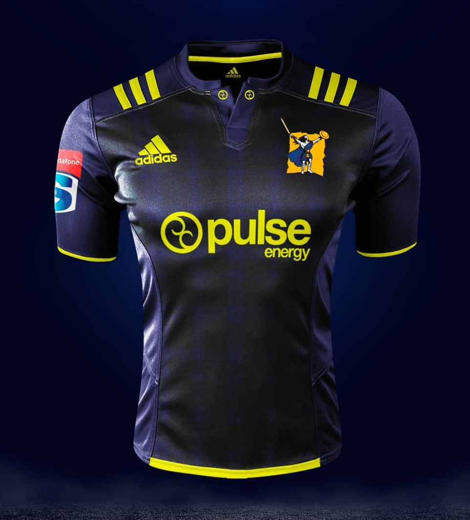
Highlanders Home
-
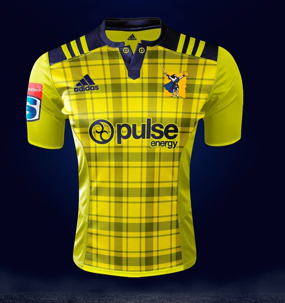
Highlanders away
-
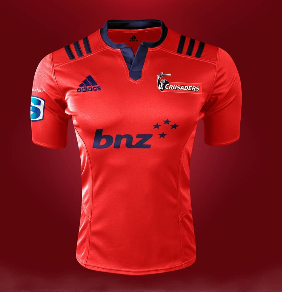
Crusaders home
-
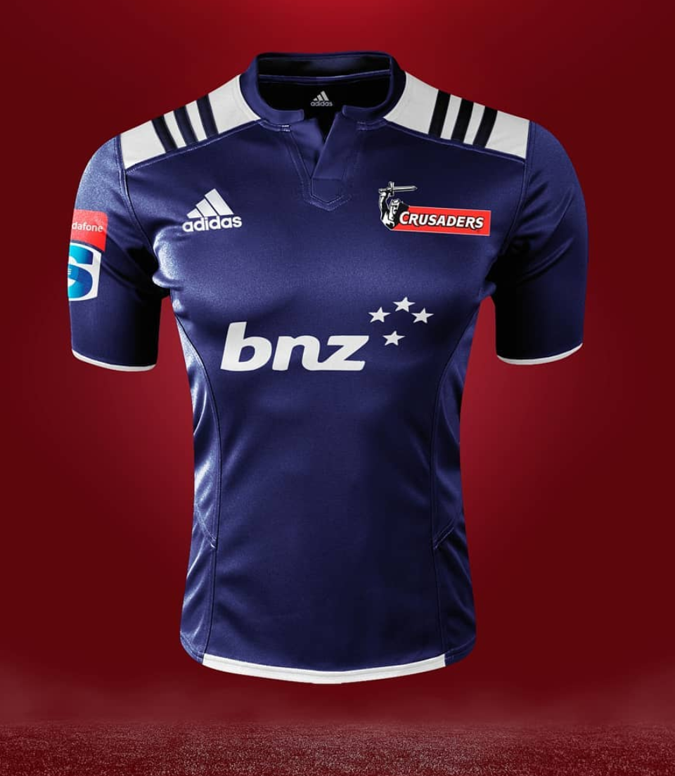
Crusaders Away
-
@Canes4life Crusaders one has to be fake. They said the imagery of the sword and shield was gone. Also that BNZ logo looks garbage.
-
-
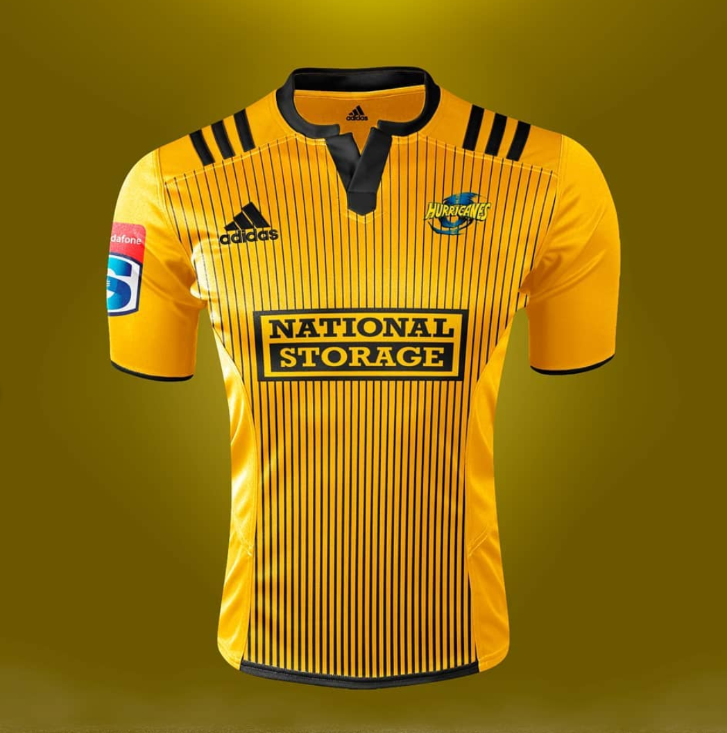
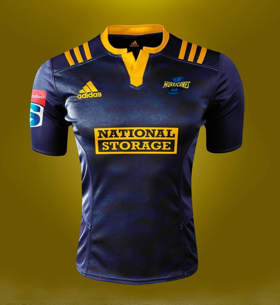
Hurricanes Away
-
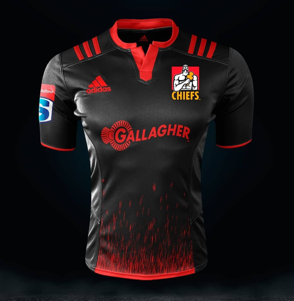
Chiefs home
-
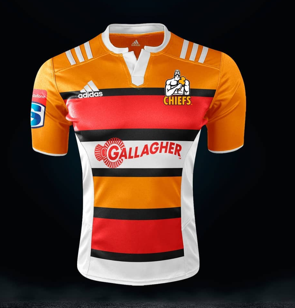
Chiefs away
-
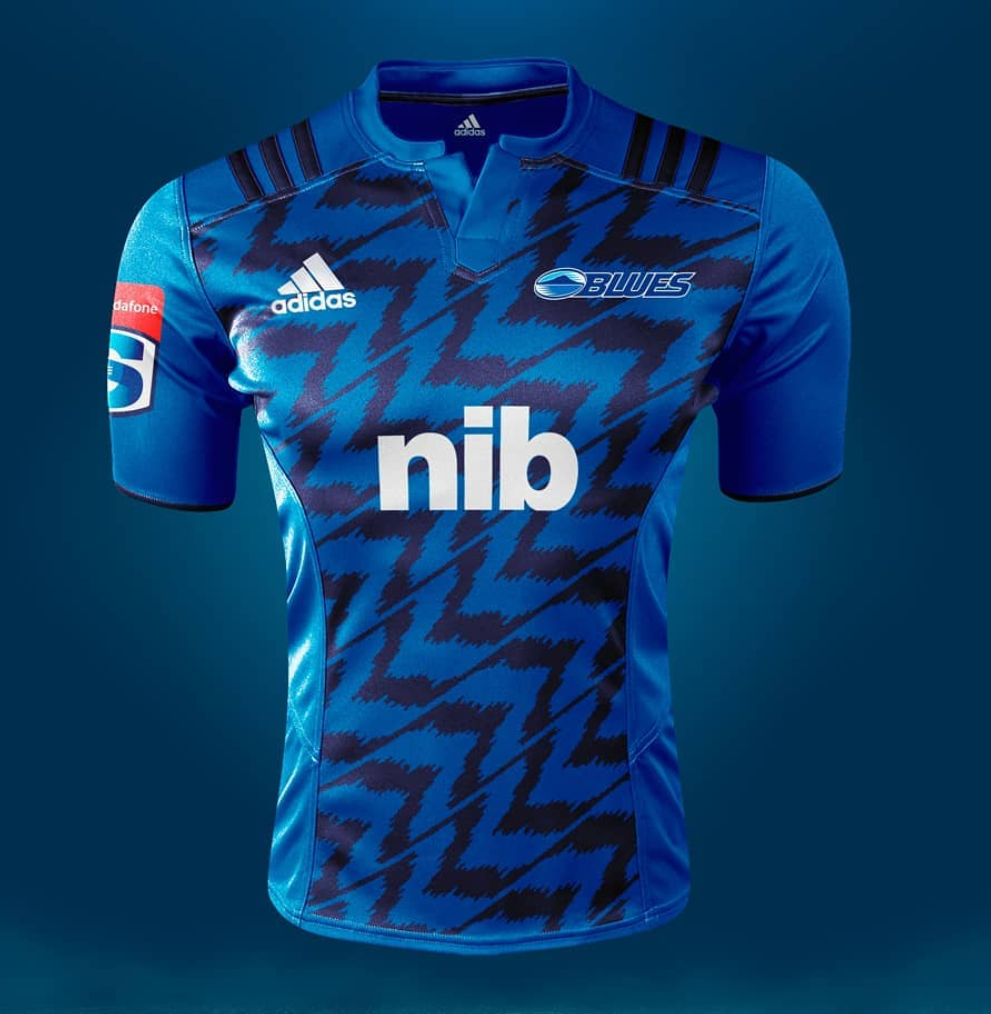
Blues home:
-
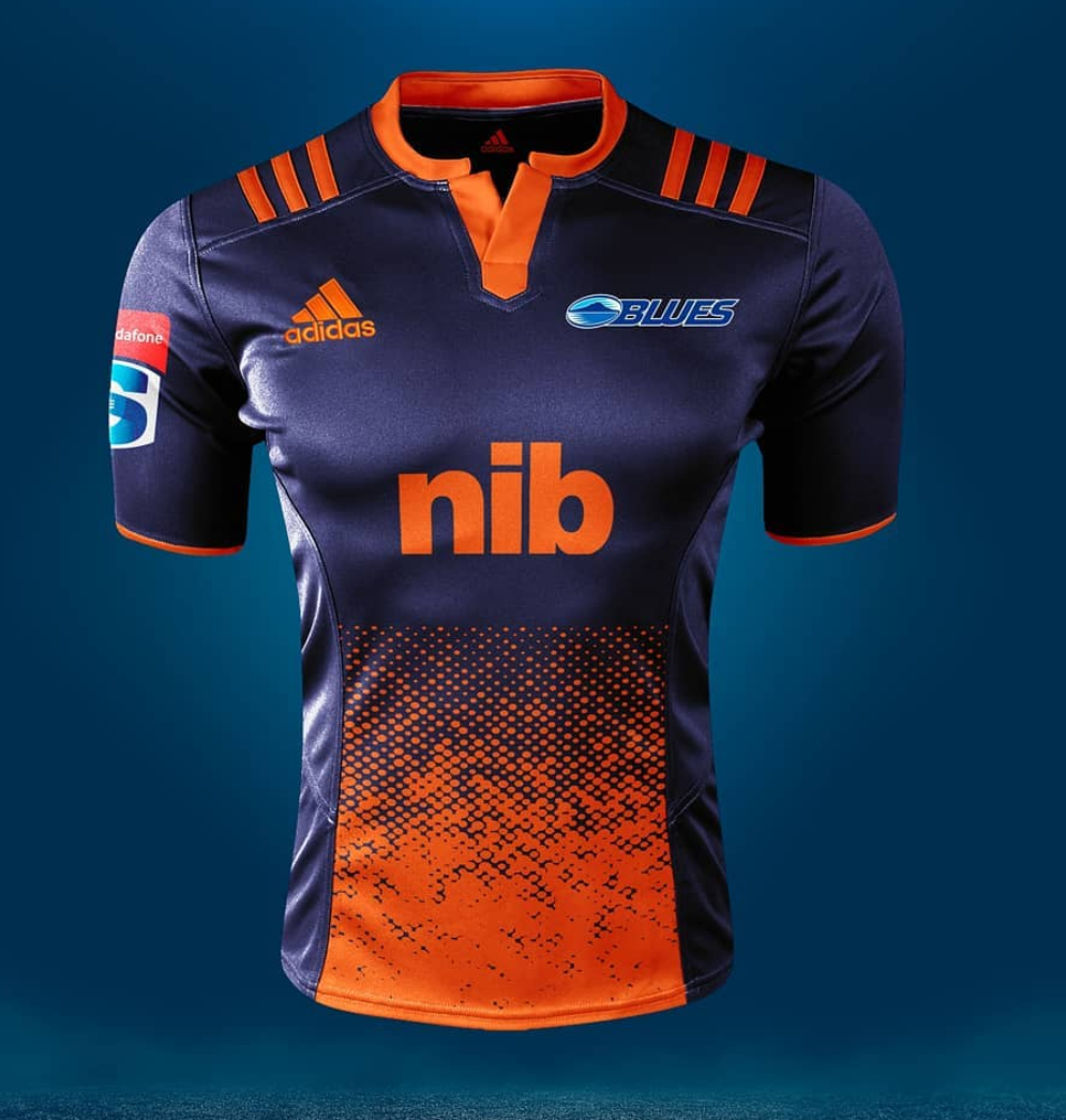
Blues away
-
@Yeetyaah yeah not sure how real they are. Highlanders home jersey is probably the best.
-
@Canes4life Yeah the Landers ones actually look decent tbh. Thanks for these. I'm a huge jersey fan and collector. Even if the Chiefs have that shit ass looking kit, I know I'll still get one.
-
@Yeetyaah The Chiefs home jersey looks like it should be the Crusaders. I really hate the pin stripes of the Canes home jersey.
-
I feel like these are just ideas from designers and are not the final product.
-
@No-Quarter yeah the finer details are a bit off so you are probably right.
-
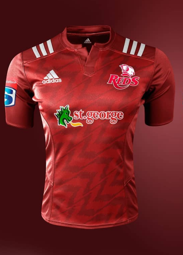
Reds jersey looks sick though:
-
@Canes4life still interesting though
")
