Terrible kits
-
@Bovidae said in Terrible kits:
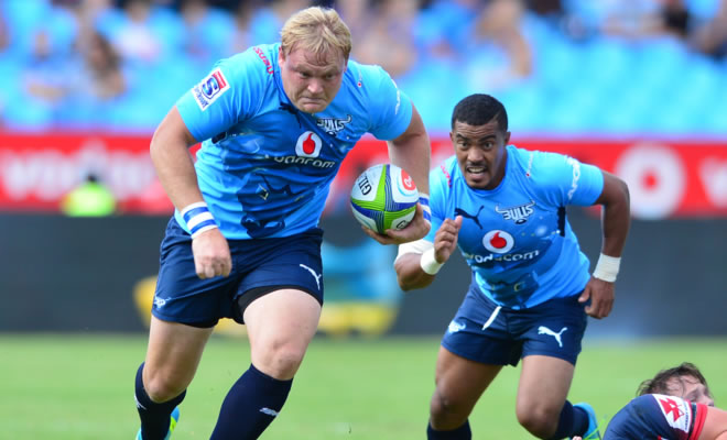
I was surprised that the Bulls wore their alternative strip (dark blue) when they played the Chiefs in black. This rule that there is a home and away jersey is stupid. Common sense should prevail when there is a colour clash.
Although if the players were considerate enough to play the match with their fronts facing the camera at all time, then less of an issue:

-
Whatever happened to the home team playing in their alternate jersey if there was a clash?
-
you can't get lower than this abortion

-
@mariner4life BOP could only afford 2 colours in their jersey!
-
@mariner4life said in Terrible kits:
you can't get lower than this abortion
Back in the day Mr Waikato Rugby went to Mr Canterbury jersey maker and said 'Mate we've got fuck all money to spend. What can you throw together from the offcuts?'.
Then they decided it wasn't quite right so peeled a label off their bottles of river water and stuck it on the front. Job done. -
@mariner4life you are forgetting this fave of @Nepia
-
@taniwharugby We really need an unlike button!
-
@mariner4life said in Terrible kits:
you can't get lower than this abortion
Never going to get a "clash" with that.
A great example of function over form/fashion. -
-
@Rapido the purple one is good as the defender blends with the corner flag.
-
@taniwharugby said in Terrible kits:
@Rapido the purple one is good as the defender blends with the corner flag.
They just want to look like the Melbourne Storm
-
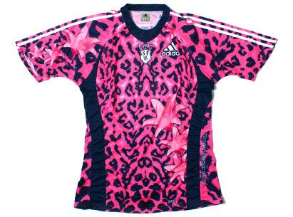
Pink leopard print from Stade Francais must be up there
-
-
started actually naming...
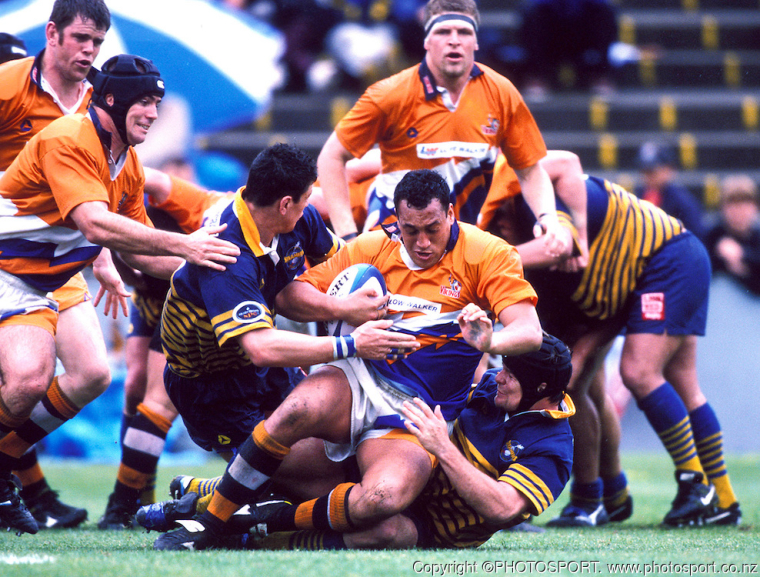
the list could be much bigger, no highlanders in there
blue is far too commonly used
-
-
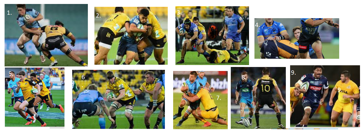
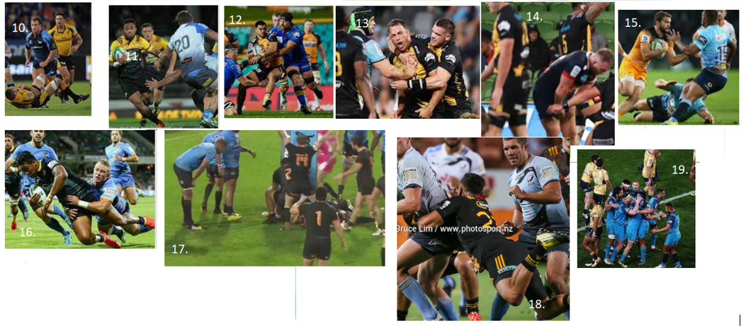
I’ll make a start but without the ability to enlarge the shots I am probably hopelessly wrong
- Waratahs v Hurricanes
- Hurricanes v Blues
- Hurricanes v
- Force v
- Hurricanes v Waratahs
- Blues v Hurricanes
- Rebels v Jaguares
- Hurricanes v
- Brumbies v Force
- Jaguares v Waratahs
- Bulls v Jaguares
- Force v Chiefs
- Blues v Hurricanes
-