-
@No-Quarter just count them ( obviously much harder in any thread involving Foster )
-
All worked fine for me. Will take a day or two to get used to the new layout.
Screen layout on the Chrome shortcut on my Android phone is way better
-
Looks like article embeds aren't working.
 Heavy rain and severe gales due to lash parts of country this week
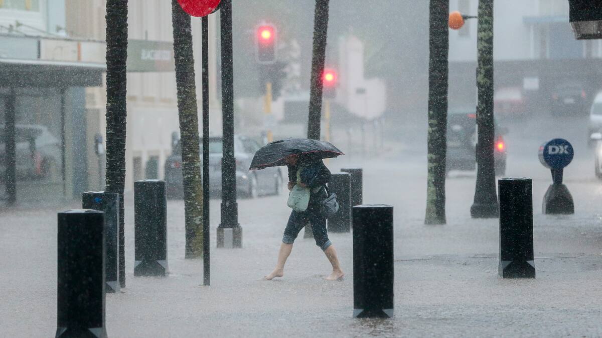
Both islands are in for a mixed bag of weather conditions this week.
Twitter test:
-
If one is to be be particularly picky ... I do find the default UI quite bright.
If there's any easy of dialing back the brightness that'd be great.
Conversely am not a fan of the dark mode ... if there's any way of making that less dark ... 😀
-
PS Dark mode is preferable. Is very harsh on my GOM eyes otherwise.
-
-
-
@Duluth I don't remember how it was before the change, but is it possible to make the thread title stay visible when you scroll down the posts, so you can actually see what thread you're in?
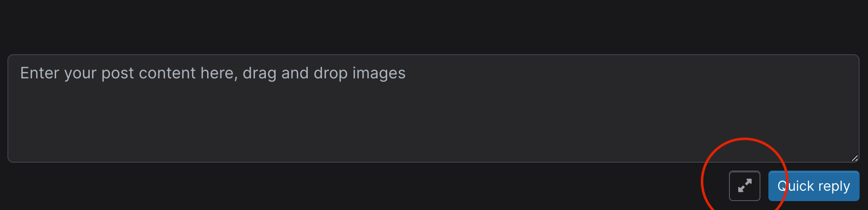
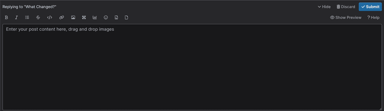
Another thing: can you make these icons visible when you hide the preview?

Edit: it may not be hiding the preview; maybe it's when you don't expand? If you expand, you see the icons; if you don't expand you don't see them.
Anyway, is it possible to have the preview open by default?
-
@Stargazer Do you mean the Quick Reply? Because that should be kept simple, you can click on this button to get the full reply window - which has those controls with or without the preview;
-
Sorry, I had edited my post.
I'd actually prefer to see the icons I posted when I'm writing a quick reply, so you can also quickly add an image or bold/italicise words, but it would all be solved if you could chose to see the preview screen by default.
In the previous version, I had the preview open by default. Now I first have to click on the expand icon (in your red circle), then click on 'preview', before I see it. So it has become slower. Also, the screen you see when you expand, takes up half the screen. That's more than it used to be, I think.
-
If you enable the Preview in the full reply tab it should remain selected for the next time, same for any height change of that window.
Quick Reply should be simple IMO, but understand the preference. It's been particularly good in match threads for me, been testing that in yesterday's game. So one more click for content heavier posts.
-
@Kirwan there's a need for a Grumpy Old Man non-extreme mode
-
I do like being able to click on who you replied to to get back to that post that wasn't there previously (at least not on my phone).
-
@Kirwan said in What Changed?:
Quick Reply should be simple IMO, but understand the preference. It's been particularly good in match threads for me, been testing that in yesterday's game. So one more click for content heavier posts.
More importantly that would be a template change. As I mentioned in the first post I don't have control over most changes in the new theme (without committing a lot of time, forking code etc etc).
Only styles and hiding/showing things
What Changed?